Sierra-Olympic
-
Category
Branding
-
Client
Sierra-Olympic
-
Link
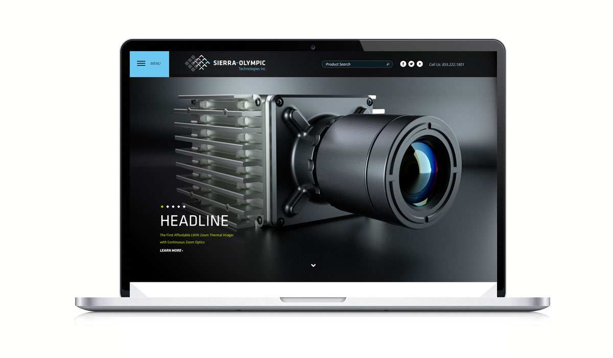
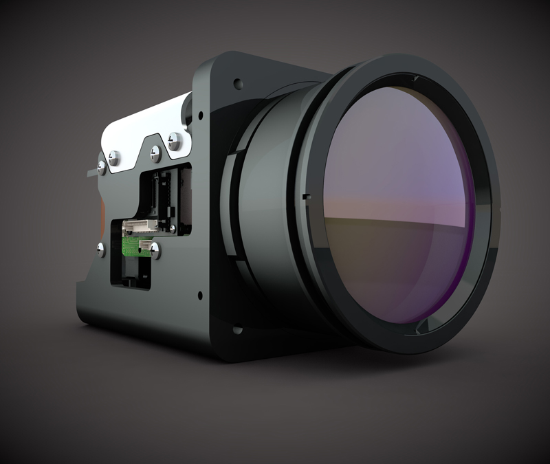
Sierra-Olympic, a local manufacturer and reseller of infrared cameras, came to Locus Interactive with a goal of updating their brand identity. They knew their logo looked a bit tired and their colors could be modernized—but they also knew the brand aesthetic couldn’t deviate too much from the original since it had become easily recognized in their industry.
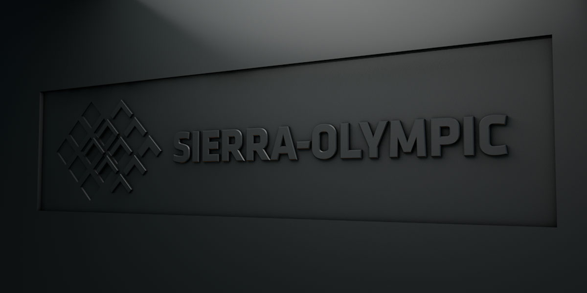
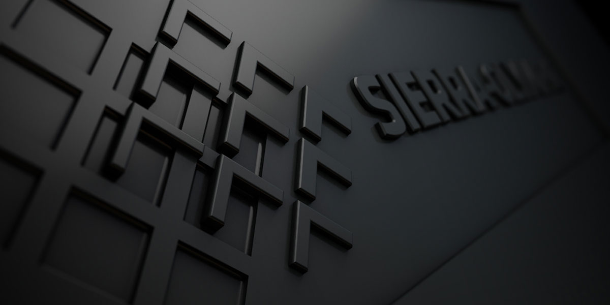
With clear direction set forth by the client, our creative team let the juices flow and went back to Sierra-Olympic with six different logo variations—some close to the original logo composition and others further away. Mountains, technology, lenses, and light influenced the designs, and modern typography gave it the ‘current’ feel the infrared technology company was after. In just three quick rounds of revisions, Sierra-Olympic selected the logo closest to its original composition, but featuring a more “techy” font and brighter accent colors.
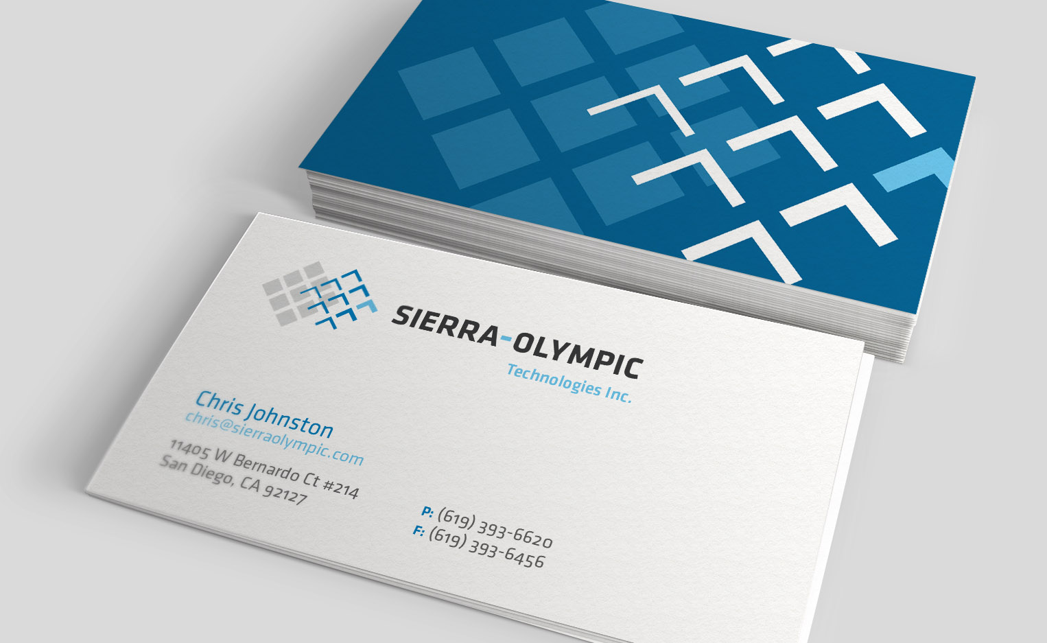
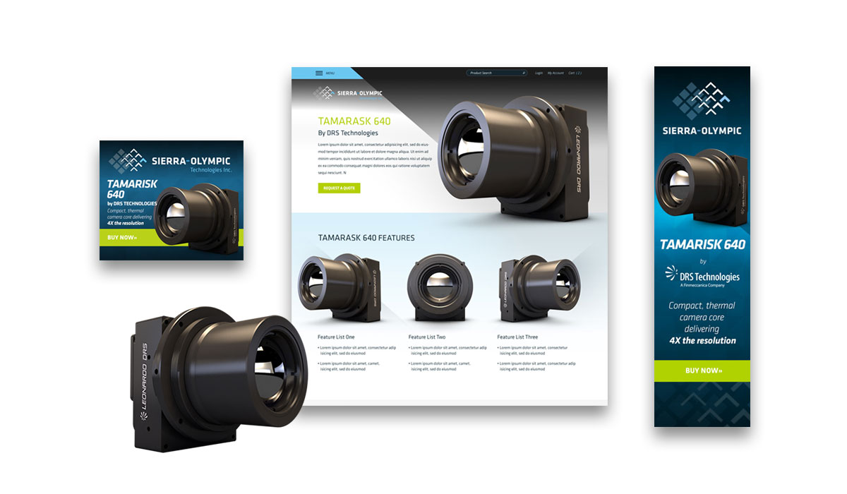
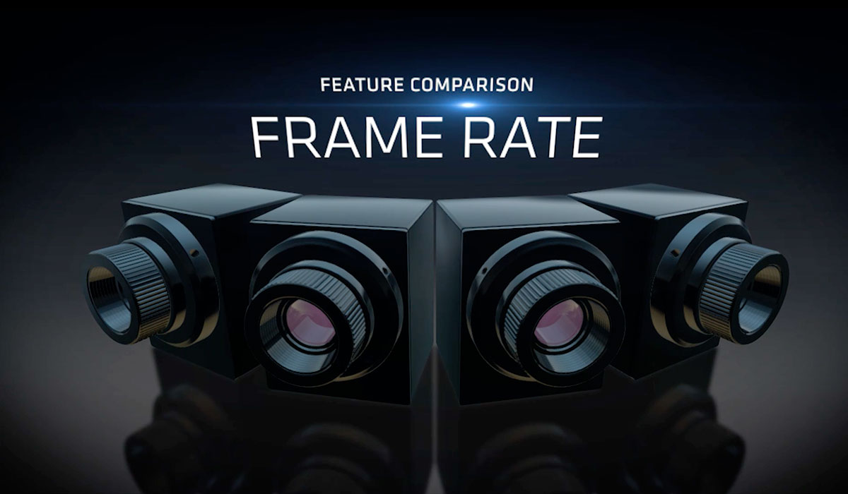
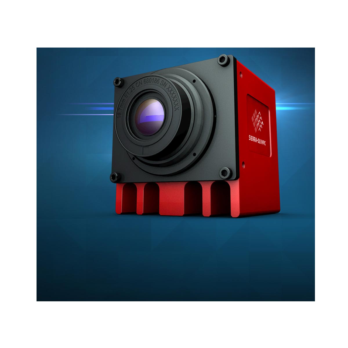
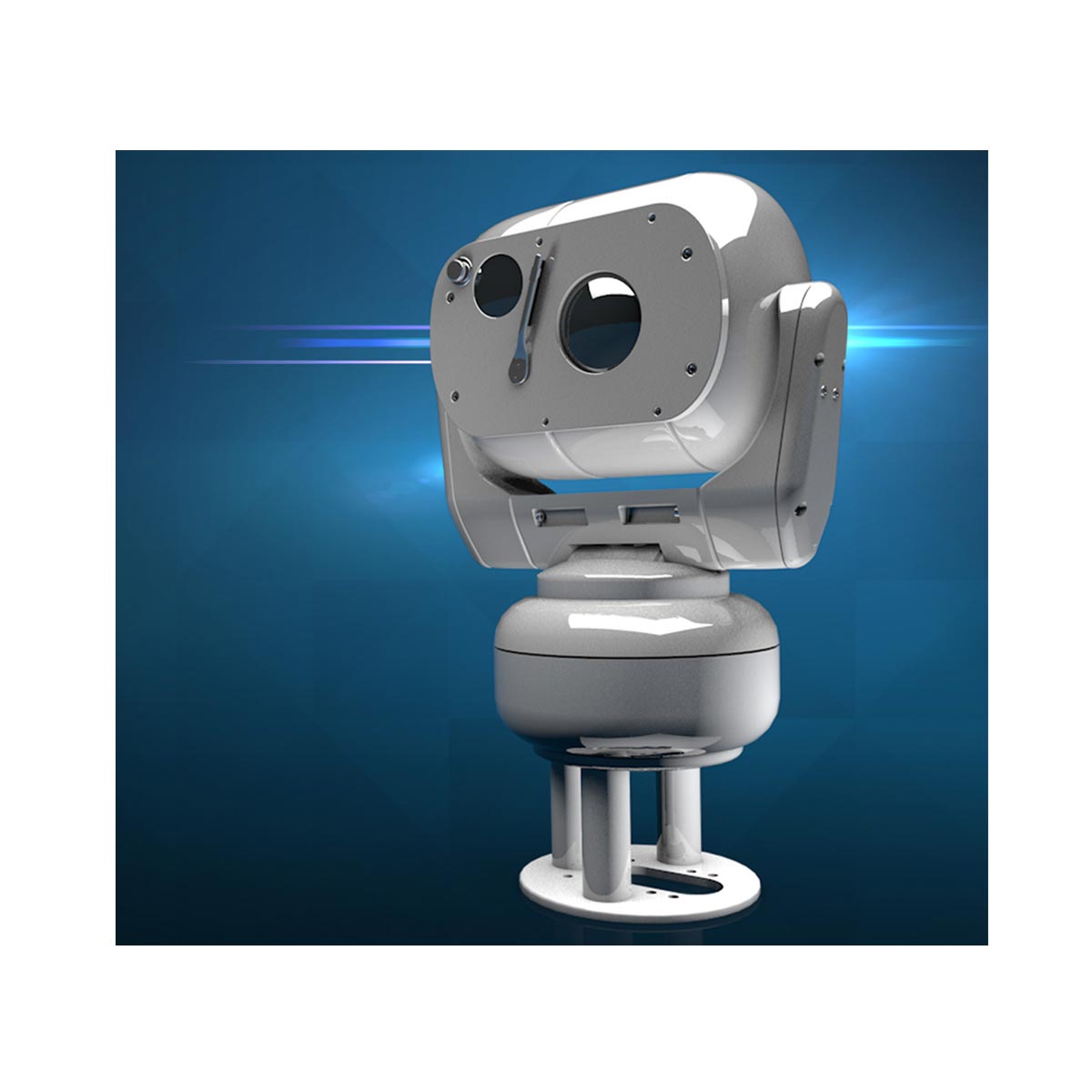
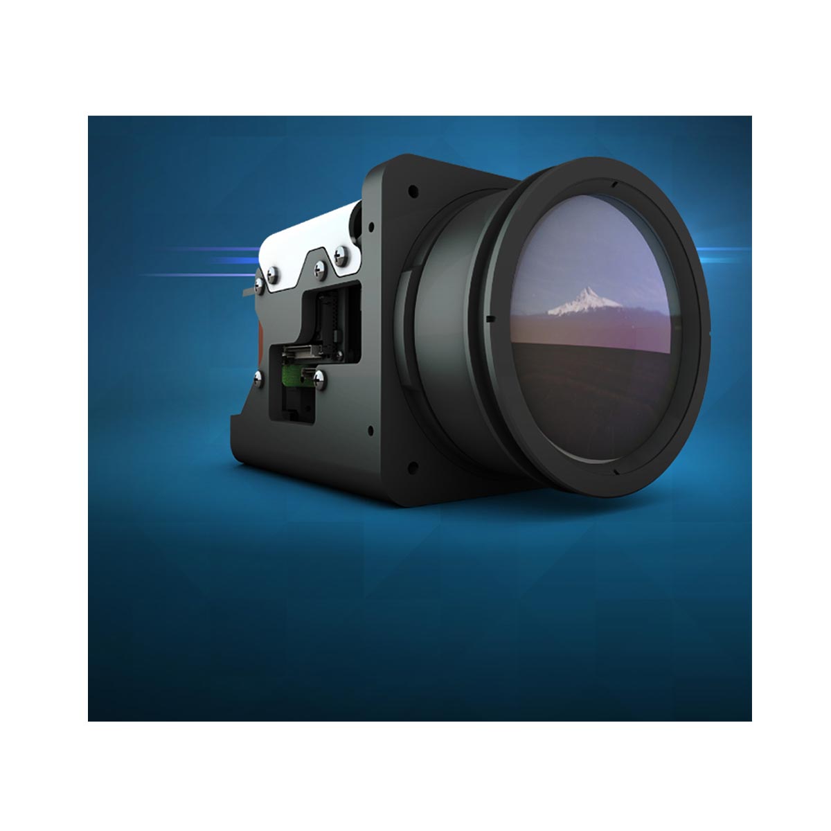
The new mark became the foundation for their comprehensive brand guidelines we created, and from there we applied the new look to a trade show booth, letterhead, business cards, products, and sales sheets. The logo was even rendered in 3-D to be used in online animations and videos.