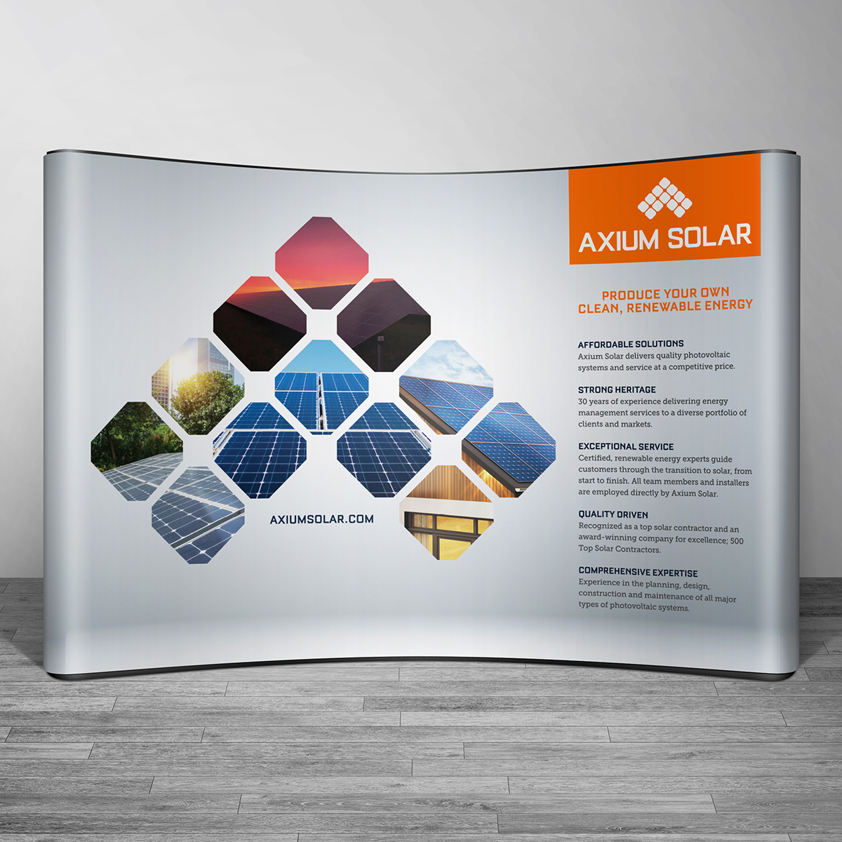
Axium Solar
Axium Solar, a leading Texas solar provider, came to Locus Interactive with the goal of recreating their corporate brand identity. Locus Interactive started the process by listening to and understanding Axium. They then developed a brand platform that will serve as a reference tool to guide Axium in all of their decision-making processes throughout their organization. From products to customer service to marketing, these core brand attributes will shape who Axium is, how they act, and what they say – it will be the impression Axium leaves on their customers – their BRAND IDENTITY.
After that, Locus tackled a logo redesign. The existing logo was designed over 30 years earlier when the company focus was on electrical contracting featuring wind turbines. They wanted a fresh, modern, new look that represented their updated company direction of renewable energy sources while avoiding departing from the heritage and recognition of the brand.
Locus creatives went to work developing several logo explorations ranging from abstract and modern to subtle and refined. With 6 relevant options, Axium Solar chose the mark that spoke to them – an abstract A shaped by solar panels with the middle panel representing the sun. The font was updated to a more modern, clean font, and their main brand color was updated to a fresh, more vibrant orange. Axium’s new logo was relevant to their target market and elevated their brand, but stayed true to their roots.
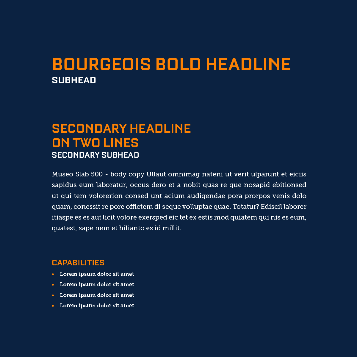
Locus then continued to develop their color palette, typography, a tone of voice, and image direction, which was then applied across all aspects of their company from letterheads, to business cards, to trucks, to tradeshow booths, to company apparel, and finally to a brand-new website design.